



Feedback forms
Comment forms allow you to create forms, layouts, or requests in order to collect additional information. This information is then presented each time you dial records through a campaign or receive calls from queues.
These forms are specifically designed to be used with queues and campaigns. They are displayed automatically when a new call is received in the queue or when a new campaign call is initiated. For the feedback forms to be available, it is necessary to upload the form to PBXware and set the "Send feedback forms" option to "Yes". Without this configuration, no feedback form will be accessible. Additional information on using feedback forms is provided in the text below.
Add a form
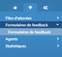
To access the feedback forms, simply go to the contact center menu and choose the “Feedback forms” option. From this menu, you have the ability to access all the feedback forms currently available.
Furthermore, you can add new feedback forms or make changes to existing ones, including deleting them if necessary.
Create/edit forms
By selecting "Add a feedback form", a new dialog box appears, offering users the ability to customize the form. At the top of the form, you can specify a name. Fields can be added by dragging them from the menu on the right and dropping them into the designated area.
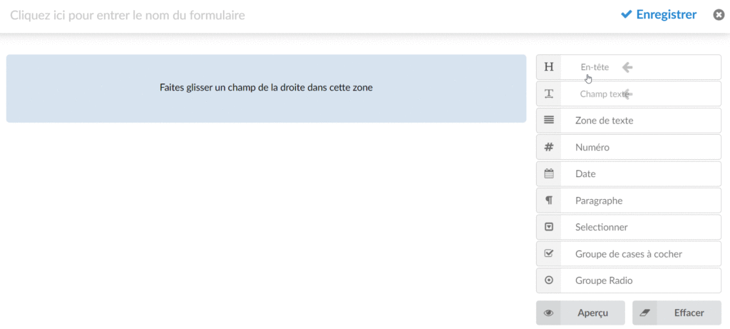
The other available options are:
- Save button :
Click to save the feedback form.
- Close button :
Clicking this button will close the feedback form editing area (note that all unsaved changes will be lost if users close this window).
- Preview button :
Click the Preview button to preview what the form will look like when the application opens. Please note that the scaling will not be the same, as the application window may have a different size.
- Clear button
Click to delete all fields of the feedback form (a warning message will be displayed).
Available fields
Header
The header establishes the title or label, reminding the agent of the content of the feedback form. It does not necessarily imply a response or input from the agent.
Text field
Main text input field. Users can enter a text value that will be submitted later when the feedback form is displayed in the agent window.
Editing the text field:
- Required : a checkbox that indicates whether the field should be mandatory or optional. The form will not be submitted if no value is entered when the box is checked.
- Label : Text that will be displayed above the input field. It can be used to describe what the input value should represent.
- Name : A field name that will identify the field once the form is submitted.
- Value : set a default value for the field.
- Placeholder : sets the placeholder text for the input.
- Type : A selection field with 4 different options:
1. Text field: a regular text input
2. Password: the entered value will be masked and displayed as "******".
3. Email: The entered value will represent an email and will be validated. The form cannot be submitted if an invalid email address is entered.
4. URL: The input value will represent a URL and will be validated. If an invalid URL is entered, the form cannot be submitted.
- Maximum length : set the maximum number of characters that can be entered.
Text area
A multi-line input area can be used to enter a larger amount of text.
Editing the text area:
- Required : a checkbox that indicates whether the field should be mandatory or optional. The form will not be submitted if no value is entered when the box is checked.
- Label : The text is displayed above the input area. It can be used to describe what the input value should represent.
- Name : A field name that will identify the field once the form is submitted.
- Placeholder : sets the placeholder text for the input.
- Maximum length : set the maximum number of characters that can be entered.
- Lines : sets the number of visible lines before a scroll bar is displayed. This also affects the size of the area.
Number
Field that can only have a numeric value. On the right side of the input, an option can be used to increase/decrease the value.
Editing the number:
- Required : a checkbox that indicates whether the field should be mandatory or optional. The form will not be submitted if no value is entered when the box is checked.
- Label : The text is displayed above the input area. It can be used to describe what the input value should represent.
- Name : A field name that will identify the field once the form is submitted.
- Value : set a default value for the field.
- Placeholder : sets the placeholder text for the input.
- Min. Value : Sets the minimum value that can be entered.
- Max. Value : Sets the maximum value that can be entered.
- Step : Represents the amount that will increase/decrease when clicking the buttons located to the right of the input field.
Date
Date selection field. The Date/Time format will be the default system format (chosen in Administrator Settings -> Date/Time). The date displayed when editing the field will be the current date.
Editing dates:
- Required : a checkbox that indicates whether the field should be mandatory or optional. The form will not be submitted if no value is entered when the box is checked.
- Show the time selector : a checkbox that enables a time picker. Checking this field will display another input field where the time can be selected. The default time is the current time.
- Label : Text that will be displayed above the date area. It can be used to describe what the date value should represent.
- Name : A field name that will identify the field once the form is submitted.
Paragraph
Multi-line text field. It has no input, so the user will not be able to modify its value. This field can be used to take notes for agents that will be displayed when the feedback form is loaded.
Editing the paragraph:
- Hide in preview : Hide the paragraph in the preview.
- Content : Specify the content of the text that will be displayed.
Select
Drop-down field in which users can select one or more values.
Select Edit Options:
- Required : a checkbox that indicates whether the field should be mandatory or optional. If the box is checked, the form will not be submitted if no value is selected.
- Label : The text is displayed above the input area. It can be used to describe what the input value should represent.
- Name : A field name used to identify the field once the form is submitted.
- Reserved space : sets the placeholder text for the input.
- Min. Selections : sets the minimum number of values that can be selected.
- Max. Selections : sets the maximum number of values that can be selected.
- Options : Set the selectable values. Each option has four actions.
- Allow multiple selection : Defines whether the agent can select multiple values or a single one. Checked refers to many, unchecked to a single value.
- Add an option : Used to add multiple values to the field Options.
Checkbox group
multiple-options field where users can check one or more values.
Editing the checkbox group:
- Required : a checkbox that indicates whether the field should be mandatory or optional. If the box is checked, the form will not be submitted if no value is selected.
- Label : The text is displayed above the input area. It can be used to describe what the input value should represent.
- Name : A field name that will identify the field once the form is submitted.
- Options : Set the values that will be selectable. Each option has four actions of its own.
- Add an option : Used to add options to the field.
Radio group
multiple-options field where users can check one of the given values.
Editing the radio group:
- Required : a checkbox that indicates whether the field should be mandatory or optional. If the box is checked, the form will not be submitted if no value is selected.
- Label : The text is displayed above the input area. It can be used to describe what the input value should represent.
- Name : A field name that will identify the field once the form is submitted.
- Options : Set the values that will be selectable. Each option has four actions of its own:
1. The checkbox on the left defines whether the value should be selected by default.
2. The left entry represents the value that will be submitted.
3. The right entry represents the label text that will be visible to the user.
4. The button on the right removes the option.
- Add an option : Used to add options to the field.
Use a feedback form
After creating a feedback form, users can set any queue or campaign to use this form.
For the queues
Under each "queue", there is a gloCOM section that contains two options. Among these two options, users can define whether they want to use the "Feedback forms" in the application.
To open the "Feedback Forms" in the application, the user must set the "Send Feedback Forms" option to "Yes" and select the feedback form they wish to use.
If this option is set to “No” or a single feedback form is not selected (even if this option is set to “Yes”), the application will not open any feedback form.

Submit comment forms
After opening the feedback form in the application, the agent should be able to submit this feedback form. The submitted data will be saved in a CSV file.
Delete the feedback forms
In the GUI, under the "Home > System" section, the user can set an option for how long these CSV files will be kept before deletion (by default, this delay is set to 4 weeks).
Download the feedback forms
By browsing the CC > Queues > CDR section, users can download the fomment forms by checking the box in front of the CDRs and clicking on Download the feedback.
For the dialer
To configure feedback forms for the campaign, please follow the steps below:
- Go to Dialer > Campaigns > Edit .
- Click the button Numbers in the Campaign Data group.
- Click on Edit on one of the CSVs.
- Select one of the feedback forms previously created.
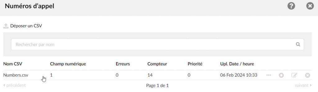
NOTE: If no feedback form has been created previously, users will not be able to select anything in this field.
Matching headers
For feedback forms to work with Campaign, the user must create the same headers in the feedback form and download a CSV file . This is important because if the header does not match, the data submitted via the feedback form will not be displayed in the CSV file.
For example, if the CSV file has a header named « LastName », there must be the same « LastName » header in the feedback form. Otherwise, the data will not be populated in the CSV file at all.
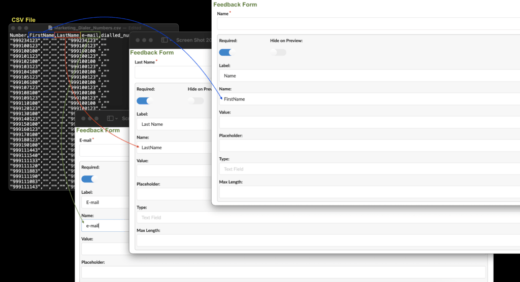
The field that must be modified in the feedback form is called "Name". By default, this field is populated in the format textfield_1654954… / textarea1654958… / number_1654957… . This format depends on the name of the field that users use to create feedback forms ( TextField, TextArea, Number ).
Submit comment forms
After opening the feedback form in the application, the agent should be able to submit this feedback form. The submitted data will be saved in a CSV file.
Feedback forms download
Users can download a CSV file by clicking on three dots inside “Dial numbers” and selecting “Download the CSV file”.
Turn forms into templates
The comment form fields can be turned into templates so that certain values are imported from the CSV into the field entries. This can be done by inserting CSV header values between the %% symbols. A simple CSV file is uploaded and contains two rows. The first row represents the CSV headers and the second displays information about Numbers.
Example:
Number, First name, Last name, Address, Age
100, John, Doe, Somewhere on a street, 22
To create a template, please follow the instructions below.
Once this form is opened in gloCOM, the fields with values or labels between %% will be replaced by the corresponding values from the CSV file.
Example (please refer to the screenshots):
- %FirstName% will be replaced by John .
- %LastName% will be replaced by Doe .
- %Address% will be replaced by Somewhere Some Street .
Each field has different parameters that can be turned into a template.
- Header: Label
- Text field: label, value
- Text area: label, value
- Number: Label, Value
- Date: Label
- Paragraph: Content
- Select: Label, Option value (left input), Option label (right input)
- Checkbox group: label, option value (left entry), option label (right entry)
- Radio group: label, option value (left entry), option label (right entry)
NOTE: This process is case-sensitive , which means that the value inserted between %% must fully match the CSV header.
Submission
The name of each field to be submitted will be used to identify that same field once the form is submitted. If the name of the field matches one of the headers, the value of that field in the CSV file will be replaced by the submitted value.
The CSV headers must not contain any of the following characters if they are to be used in the feedback form template.
- chr(46) . (period)
- chr(91) [ (open bracket)
- chr(128) – chr(159) (miscellaneous)
TIP: avoid creating CSV headers with these characters.
Submission will fail if the fields are named as follows:
- Include.Invoice.Tax
- Check[open]
Suppose one of the characters mentioned above is included. The warning message will be displayed in this case, indicating “Warning: the file contains invalid header characters. Please read the documentation.”
Once the sample feedback form template is loaded and the template values filled in, it is possible to edit them before submitting the form.
Example (please refer to the screenshot):
Suppose users set the field Name of the number (representing the entered age) on Age so that it matches the same CSV header Age . In this case, the submitted value will be filled in the Number field of the CSV file.
Once the form is filled with the preferred values, it is time to modify the age value to 30 years old and to submit the form. If the same CSV file is loaded again under this form or downloaded, the Age entry will have Value: 30 and the CSV file will contain the following elements:
- Number: 100
- First name: Jean
- Last name: Doe
- Address: Somewhere, on a street
- Age: 30 years old
NOTE: If several values must be selected, they must be placed between double quotes because of the comma delimiter.
